Footprint charts

I’ve spend hours over classic candle charts looking for some clues and traces that would indicate what the marker is doing and what will do in the near feature. Definitely it’s not easy.
Trading is a zero-sum competition. For someone taking money from the market, someone else has to bring them. All strategies are allowed in this game, including confusing opponents. In this game of appearances, the one who finds more traces and interprets them more accurately wins.
Is it possible to see what was happening in the candle? Is there a magnifier that will show us what has happened inside the candle and allow to find some traces?
Looking for an answer to this question, I came across a different approach to chart analysis, called footprint chart.
What is a Footprint chart?
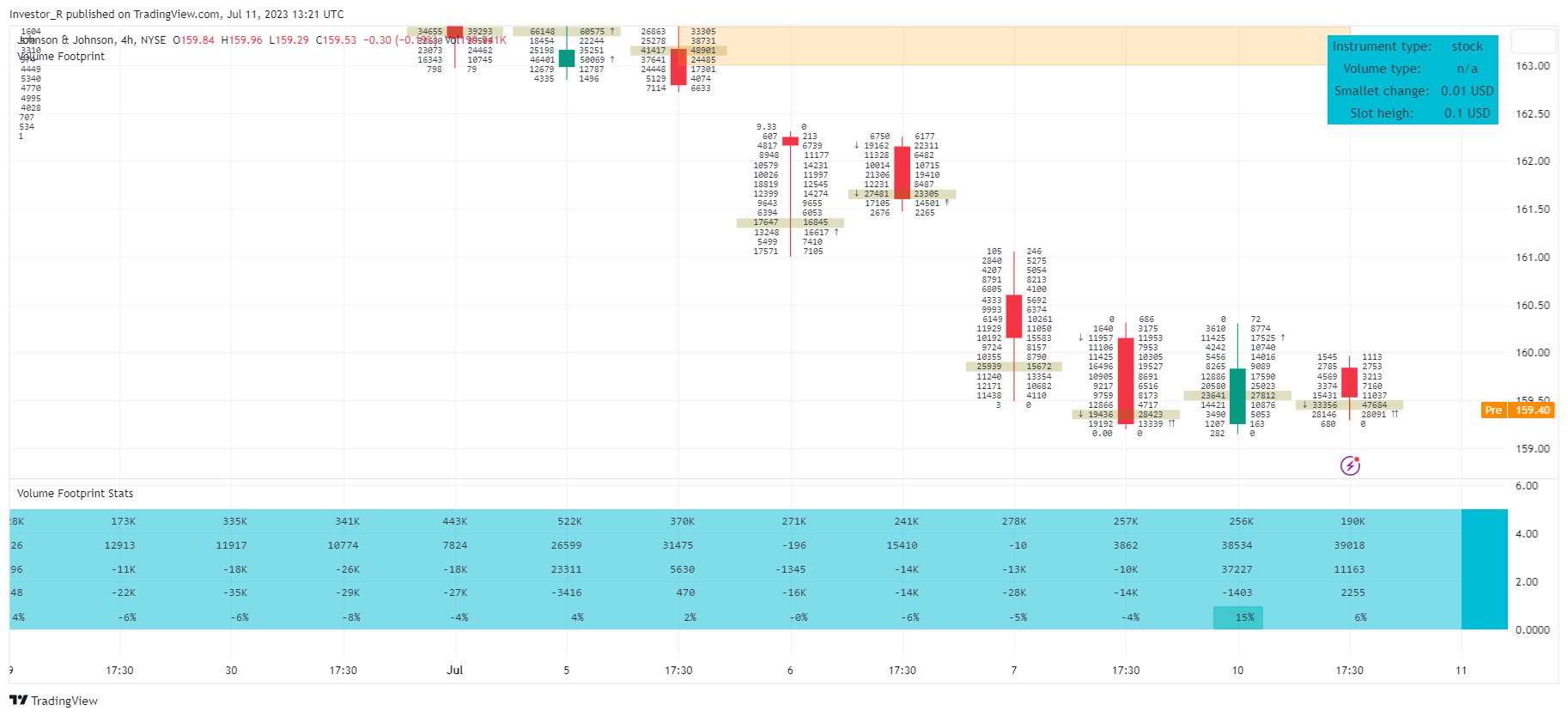
It’s a chart that presents traded volume on candles splitted into slots. Each slot is corresponding to the price range and described by sum of transaction volume made in that range. To show even more precise information volume is separated into up and down volume, in the same way as on the Volume Profile. It can look like this:

On the left side of the candle we can see volume down values and on the right volume up values.
This tool is available on many platforms under different names: Cluster chart, bid/ask profile, bid/ask cluster, numbered bars.
How it works ?
To understand it better we should describe how typical exchange is working and how the price of the asset is changing. Typically exchange has an order book with bids (buy limit orders) and asks (sell limit orders ) placed there by passive market participants. Typically bids (buy orders) have lower price than the current one (last done transaction) and asks (sell orders) have higher price than the current one. Passive market participants are creating some liquidity pool (are also food for auto trading algorithms), but to change the price we need active seller or buyer, that will be motivated to pay more or sell cheaper than the last one.
Footprint chart was introduced for order flow analysis. With order flow we know all transactions and we can calculate sum of bids and asks at particular price level.
The bid value is the sum of the traded volume from pushing price down transactions. It means that we have more active/motivated sellers than buyers and price is going down. We can say that Sellers are aggressive and they are selling to passive buyers (orders with lower price).
The ask value is the sum of the traded volume done by active buyers. They want to buy more than sellers are willing to sell on that price so price is going up. We can say that Buyers are aggressive and they are buying from passive sellers (orders with higher price).
What else we can see on typical footprint chart ?
- Slots with the biggest volume
It’s a quite different situation when most of the candle volume was traded at the high candle price with compare when it was traded at the low candle price. At more important price levels, we can find slots with a volume much larger than the others in the candle. Volume clusters are an extension of this concept (check below).
- Delta between Asks and Bids
Having bids and asks we can calculate delta as a difference between Asks and Bids ( delta = Asks – Bids) in the slot or in candle globally. Quite naturally candle delta will be negative for price going down and positive for price going up.
- Biggest and smallest delta value from the candle.
Can signal a fight between buyers and sellers as a certain price level.
- Imbalances between slots
For bid it’s a value calculated by comparing bid from current slot with ask from candle above. If bid is bigger x (typically 3-4) times than its marked with color or symbol . For ask it’s a value calculated by comparing ask from current slot with bid from candle below. If ask is bigger x (typically 3-4) times than character is shown after it.
If many slots in candle have such imbalances only on one side than it shows aggressivity of buyers or sellers – It may be a short term direction of the market.
- Candle Volume Core - Volume Clusters
Group of slots\candles\area where most of the volume was traded. Tracking such groups can also be useful, as places where price can find resistance and may change direction.
- Filter on biggest trades.
Showing on chart only the biggest trades – Lazy whales trades.
As you can see the footprint visualization seems to deliver a more complex view of the market, than the classic candle chart.
Footprint on TradingView
TradingView was lacking of a quality Footprint chart implementation, so we decided to create our own Volume Footprint package. Unfortunately, TradingView currently is not allowing order flow analysis (More about limitations you can read in “Price-volume analysis on TradingView” post). Instead we are using Volume Profile like approach.
Volume Footprint package consists of few scripts (some are still in beta and are not visible for users without access):
I. Footprint chart visualization scripts in two variants:
⠀⠀Volume Footprint - Presenting data on sides of the candle.
⠀⠀Volume Footprint Classic - Presenting volume data on the right side of the candle.
II. Supporting tools - They can support both Volume Footprint and Volume Footprint Classic scripts:
⠀⠀Volume Footprint Statistics - Script presents, in tabular form, basic statistics calculated from candle volume data, such as Delta, min Delta, max Delta and more.
⠀⠀Volume Footprint Charts - Tool presents in line chart form, basic statistics calculated from candle volume data, such as Delta, min Delta, max Delta and more.
⠀⠀Volume Footprint Candle Charts - Tool presents in candle chart form, basic statistics calculated from candle volume data, such as Delta, min Delta, max Delta and more.
⠀⠀Volume Footprint Candles - Tool drawing candles adapted for footprint chart scripts.
III. Tools dedicated to more detailed analysis:
⠀⠀Volume Delta In Candle - A line chart showing changes in delta values over a period equal to the chart interval.
⠀⠀Volume Cumulative Delta in Interval - A line chart showing changes in cumulative delta over a period equal to the chart interval.
Package is with free 14 days trial, to get it, just write on: toolkit4trading@proton.me

Footprint on the broad market.
The solution we created is not perfect, we would like to improve it a lot, but to be honest, I have not seen any better solution for the broad market. Some forex brokers offers (even high quality) order flow footprint tools. They operate on the orders/transactions from their market maker. Showing quite impressive image of transactions done with this market maker. All looks fine just it should be remembered that (in forex transaction) there is no ownership of the base instrument. With forex we have only an obligation to pay profits resulting from a change of instrument price/value. Instrument price affect forex results but generally forex transaction does not affect the value of the base instrument. Forex trading is more like a bet (if you have doubts try to transfer your position between brokers – if you are the owner of the asset it will be possible).
Knowing this you should ask yourself about the impact of the information presented on such forex order flow chart. I have not come across information that any of the stock exchanges allows you to track instruments using the order flow footprint chart. Our solution, although it seems only to be an approximation, is using the stock exchange volume (real ownership transferred for money).
Summary
I met different opinions about usefulness of Footprint approach. I'm afraid that some of the negative opinions were related to the solutions provided by forex brokers.
Assess whether these data help or rather overwhelm with an excess of irrelevant details, I leave to the individual judgment of the reader. If you are unfamiliar with footprint charts, I’m recommending: “Try them out for yourself with 14 days free trial”.
Have a nice day and good luck in trading!
Ps. If you judge the issues differently or you just want to give 5 for the work I do, write to toolkit4trading@gmail.com